Thursday 13 October 2011

INTERFACE DESIGN

These are development screens of the interface from the feedback that i received during the last class. I wanted to keep the main page being the welcome button as it seemed very fitting for the type of appeal i wanted to generate. 

This is screen shows a new development i wanted to create being the Forecast-a-tron. This idea was developed from the old school television set and suites the idea being very 1950s democratic america.


This screen is of the new feature i wanted to create in the interface being the graphing and notification's of how the user is saving each week, month and how much they are saving.


This screen shows how i wanted to re-create the sort of animation feel that my precedent generated for my interface. I feel as though the screen dosent show my idea as much but is sufficient enough for this part of the process. I wanted to make an actual sky  ceiling but had many difficulties doing so.


Thursday 29 September 2011

FEEDBACK

The feedback that i got was very helpful in the development of my process as i got advice in these areas:
- i needed to target an audience for my interface so they could be influenced by the energy saving device
- the interface needed to help the user not hinder them so i got a suggestion to add graphs
- the interface needed to look better and more appealing to the user
- how would the interface work with a certain user base

PROCESS

The target audience i wanted to relate to was a more family environment or for mature adults that are concerned about how much they are saving and how they are saving it. I pictured in my head when developing this idea a more male demographic as the idea was very different and i felt unsure how it would relate to everyone.

IDEAS

My main precedent that i want to take into my whole interface is the idea of a FUTURAMA the ironic industrial development of America. This idea is seen in the game fallout which features many classical ideas that i enjoyed whilst playing the game. These ideas are of the influence that Richard Nixon had on the american way of living and how they developed there nation into an industrial and a futuristic standard of living.


DSDN112 DEVELOPMENT

These images are of the development process i went through putting them through photoshop then into flash.


Sunday 11 September 2011

DSDN112 assignment2 storyboard

Proposal
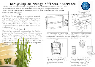
My idea is to create an energy efficient interface that helps save on energy consumption within homes. The users of the interface are targeted to be designed into the future as the technology needed is very advanced a sort of artificial intelligence. The reason why I choose to design this sort of idea is based on the times when the users have left to go to work or on a trip away for the weekend and can check or get notified if their house is using un-necessary energy.

The idea had to have a sort of punishment or reward system that would help enforce the users to actually take energy consumption seriously. Creating an adapting artwork that coincides with the consumption of energy was an idea to force the punishment in a unique experience. The artwork would be connected to the interface and response to the use of energy by reflecting either positively or negatively. The colours of the artwork will reflect negative power use by using red and dark colours and positive by using bluish bright colours, a sort of light show that is interactive.

The interface is designed to connect to the power the appliances and lighting of the house. To explain what happens when for example a light is left on, the interface will pick up when the user is home and slowly dims the light meaning that there was negative energy consumption. The artwork would reflect this as it will be red flouriest lighting. The user will relise what has happened and tries to save energy consumption to get the artwork back to normal or back into the positive.

Storyboard of the proposal

DSDN112 assignment2 Ideas

Workbook
These are the images of what i have been brainstorming ideas and generating my initial idea to create an interface that helps energy consumption in homes. The idea was to help users turn off or become aware of energy that is being used un-necessarily and make tips on saving energy more known.


I was thinking of creating an idea here were the amount of energy used would reflect in a reward or punishment system, that coincides with the users shaver if you save enough energy for the week you can shave if you don't you cant. Therefore your neighbors can see if your are saving energy by the length of your beard.
Here i brainstormed up a couple of ideas that would maybe work more user friendly and they all reach a different target audience. The first idea was making a social networking group or activities for children that they access on the internet. This would be an educational, but also fun tool that they can make tree houses which relates to there energy usage and the bigger tree house the better energy consumption.


The second idea was making an interface that monitors the power usage of a house, which can limit or increase the amount of fuel used in a car of the household. This idea creates two types of energy consumption, but lacks greater detail and needs alot of figuring out.

The third idea was my favorite as it was the reflection of energy consumption within the home by a piece of electronic artwork. The artwork would have to connected to the lighting of the house and gives the user an experience at the same time as it changes with energy consumption.


DSDN112 assignment2 research

RESEARCH
Domestic energy concsumption is the amount of energy that is spent on the different appliances used within housing. The amount of energy used per household varies widely depending on the standard of living of the country, climate, and the age and type of residence. In an average household in a temperate climate the yearly use of household energy can be composed as follows:

Average domestic energy consumption per household in temperate climates


12000 kw.h (1400 watts) Hot water
  
3000 kW·h/yr (340 watts) Cooling/refrigeration
  
1200 kW·h/yr (140 watts) Lighting
  
1200 kW·h/yr (140 watts) Washing and drying
  
1000 kW·h/yr (110 watts) Cooking
  
1000 kW·h/yr (110 watts) Miscellaneous 

These statistics are the averages of new zealand homes, and show that heat energy is a massive energy consumption. What i found interesting was that lighting was actually quite high up there with all the new energy efficient light bulbs. I think this would be a good type of energy to look further into:

This is an image that i found interesting as it is not a graph, but drawings of the type of appliances used within the home and shows what  energy they are using.

Thursday 11 August 2011

Final model DSDN112 EXPRESS-A-SMELL

Description
My idea was to make an abstract interactive tool that the user can practice and enhance there drawing ability. My initial idea was to incorporate a different sense that would spark an image for the user so they can visualize what they are drawing. This is what I thought was an easy way to teach someone how to imagine a portrait. The idea developed after some experiments and showed that most people related the certain smells to something easy and manageable to draw. From these findings I wanted to the user to express what they felt instead of drawing what they see. This was a better interaction with the user, which meant they didn’t have to step out of their comfort zone when attempting to draw the smell. The tricky part was the means of the expression, so I thought of a few ideas but drawing in sand was my favorite. Because of the reason that most drawings would look the same and have the same result in the expression of a smell. I believe the final model represents what I wanted to achieve from the start as the development of the model went through a few changes it ended up very pleasing.

Instructions

-       FLATTEN OUT THE SAND EVENLY
-       PLACE YOUR FINGER (S) IN THE SAND AT THE LEFT
-       START TO SMELL THE SAND FROM THE LEFT TO RIGHT
-       NOW SLOWLY FOLLOW WITH YOUR HAND TO DRAW AN EXPRESSION DEPENDING ON THE CERTAIN SMELLS

5 Interactive images of final model


New model

The EXPRESS-A-SMELL

The refined design toke out the two functions of the "smelling box" and made it into one sleek design.What i learnt from this process was that the paper had to be designed with small holes to help the smell sneak through. Also the smell of the sand would cover the other smells which made things a little bit difficult so i had to limit the amount of sand so they could be smelt. The colour of the paper had to be white because the type of sand would leave dust particles on the black paper which meant the user couldn't draw effectively. Overall i was happy with how it turned out and hope the idea is very usable and interactive. 

Black paper

White paper


Construction

Making the box

My first attempt to the design was just a basic wooden box with cups in it to hold the different smells. I thought of making my final model like this from the start of the project and thought it would look very appealing being out of wood. The design looked very chunky and dis-organised with a bottom piece connected to it to make where i would draw. So i decided to review my design an come up with something that looked much different. 


The New Design
At this this point of the development i found it hard to scrap my old model and come up with a new idea. I also didn't want to stay with the drawing idea so i thought that i could pastels and people could scratch on it, or using a type of sponge fluid where people could play with and move around. But the best idea was to use sand as i thought that people usually draw in the sand no matter how good someone can draw. Making a sandbox that smelt was challenging but i enjoyed playing with down in the workshop to create the design.

The process
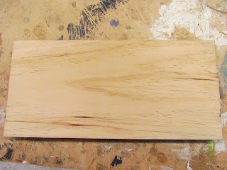
Started off with a piece of wood cut down to correct measurements.

Using the drill press i chipped out a layer 10 mm down out of the wood and then chiseled around the the outside to make it flat and even.

The corners were curved just for aesthetic's i think.

Then i drilled bigger holes anther 7mm down around the board to place chunks of the pate of smells.

A thin type of paper was placed on the design to help the sand sit on top of the smells.

Development of Smelling Box

Development
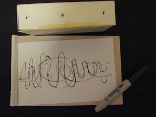
This was the last experiment that i made which would instead make the user draw what they smelt it made them express what they felt about the smell. In this test i wonted to see how i could make this work and what it would look like when someone would express a smell.

Findings
What i learnt was that i needed two parts to the design one for smelling the other for drawing. Also i learnt the different ways someone would express a smell for instance the user draw a line across the page for the three smells each overlapping. But when the user draw a single line for all the smells it looked less intense and more valuable. The problems i would have is that drawing would seem to take up a lot of paper and be inconvenient and i need to find out how i could join both parts together?

3rd Experiment

Three lines drawn
1 line drawn


Second Experiment and Findings

Experiment
In the second experiment i started to play around with the type of final box i wanted to make, and see if it would work. Also i wanted to explore a different number of smells and combinations as well. In this experiment people would draw different types of pictures relating to the different types of smells and number them off as the closet would win a prize.

Findings
This experiment was very critical to the development of my design because i found a few key areas that needed improvement. The first being that the box didn't work as well as i thought it would because the strong smells would overpower the weaker ones, due to the boxes inside being a bit to close together. Also i found out that it was hard for a user to interact with the object because it meant people would have to step out of their comfort zone and draw which would make people not wont to interact with the design. 


First Experiment and Findings

Experiment
The first experiment was relating different types of sound to imagery. The way i did it was, that i made three "smell boxes" and put a  different flavored fruit Lollie in each one. Because the user could not see what they were smelling i wanted them to picture what they smelt and draw it on a piece of paper.

Findings
i found that using these types of smells was very easy to picture and imagine so maybe even doing a combination of different smells would be very key. Also i found that everyone would draw the same type of image lets say a banana because all bananas look the same. If i was use chili and pepper this would make drawing the smell a bit difficult and people would imagine different things.


Friday 22 July 2011

DSDN112 assignment1 Storyboard

Storyboard


EXPLANATION
My initial idea was to create a drawing interactive design that helps people learn and develop there skills as a drawer. While using the morphing matrix to find a interaction i enjoyed to play around with and create an object. I felt that the senses i was using wasn't abstract and a bit different from the usual touch and sight. I was given an idea to explore maybe taste or smell and see what other people relate to these types of senses through drawings. I thought having the sense of smell would be interesting as the different imagery would range according to the different smells. My idea has developed into what i like to call smell sketching. I am going to design an interactive design that explores a users sense of smell and what imagery they relate to the smells. This is an interesting subject as it helps the user develop there drawing skills in the way of helping them picture an object and express there ideas.

DSDN112 assignment1 Ideas

My idea is to create a mix between the senses smell and touch

Smell

Touch

The way i want to achieve this is to develop a box of some sort that people can smell into not knowing what they are smelling and be able to picture an image to the smell. The reason to why i want achieve this is to help others to learn how to develop there drawing skills in an abstract way. 

DSDN112 assignment1 Development


Morphing Matrix
Design idea1
Design idea2

Design idea3